How to do Responsive Design through unified experience
Today our lives revolve around the mobile, agile and social aspects that have global appeal along with local flavours. Their impact factors could be attributed to the surge in various platforms, channels and devices that we use for both professional and personal lives. The PCs of the 90s are now complemented with the handy Smart Phones, ubiquitous Tablets and numerous trendy gadgets. Post (Snail mail) is giving way to Email, which in turn is waning in popularity compared to chatting, texting and gaming. There has been a massive shift in the roles of technology, business, products and services. Nowadays, there is one thing on the top of mind for clients, product designers and developers. No prizes for guessing the answer…Responsive Design! How can we deliver similar, if not identical experiences to our customers and users, despite the varied number and nature of the things around us? In this post, I will touch upon Responsive Design, as I see it in the light of delivering consistent and unified experiences.
The case for Responsive Design
Let us try and look at this from a technology perspective, especially computing technology at that. Till the late 90’s we were all familiar with the PC as an alternative to the manual operations. Back then there were only 3 major types – Windows, Mac and the more Open Source flavour – Unix. Applications and programmes had to be written specifically for 2 major mainstream platforms – Windows and Mac. Since the execution of the programmes depended completely on the underlying Operating System (O.S.), these had to be written and deployed specifically for these two platforms separately and explicitly. However with the advent of Java programming language, came the paradigm shift – “Write once, run anywhere”. In the early years of 21st century, Microsoft aggressively pushed its Dot Net platform and associated languages such as C-sharp. Both these were successful in ensuring the universal delivery and adoption of programmes and applications that were platform-agnostic.
New Technologies, same old problems
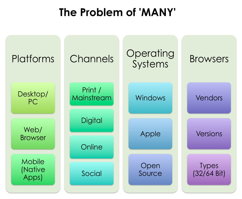
When the PC domination was waning, the cross-platform problem only got aggravated in exponential proportions. Thanks to the explosive usage of laptops in the early part of the 21st century, computing has gone mobile and portable. But this didn’t create many problems to the application and technology product vendors. Largely it was only the foot-print or size of the application that got impacted due to the new addition to the PCs. Following some other innovations in the programming and scripting languages, developers had some respite from grappling with re-writing massive applications to suit for multiple platforms. But it didn’t solve the problem completely. It only took a new shape with the onset of different browsers and their versions, numerous sizes, resolutions and vendors.
Solution to “the problem of plenty”
The good old sayings – “Variety is the spice of life” and “More the merrier” are applicable to most business scenarios and our own lives. However, with the advent of Internet and adoption of Smart Phones and Tablets, customers and consumers today are faced with the “problem of plenty”. This can be witnessed in the exponentially increasing numbers, varieties and ranges of platforms, operating systems, channels and devices. These are all increasing at such an alarming rate that often customers are pushed to the brink of confusion, chaos and frustration. But don’t lose your heart yet, there is a good news – the effective solution for these problems is a comprehensive methodology that comprises the approach, tools, techniques and resources. You can now analyse, design,develop, deliver and support solutions, products, applications for multiple platforms, channels, devices and browsers. In the following sections, we will look at how we can approach Responsive Design through the Unified Experience framework.
What is Responsive Design really
Design, by definition needs to meet the needs of the user in the right place, right time and right manner, of course, for the right users. Essentially, it is about creating products, applications and services that work and look the same across all systems, platforms and devices. While there are lot of definitions for Responsive Design, I would define it simply as designing, developing and delivering “Unified Experience“. Whether it is a product or service, the objective for product vendors is to deliver consistent, panoramic and unified experiences to their customers and users. Irrespective of the platforms, devices, underlying operating systems, numerous channels.
What makes a Design, Responsive Design
In the context of technology and programming, there had been a perennial debate on graceful degradation versus progressive enhancement. Despite the growing number of platforms, operating systems and devices, users want consistent experience. This consistent experience can be delivered only when you take care of the underlying navigation, content, presentation, functionality and interactions. Don’t forget that the customers and users are the same, their profiles and personas are not varying across the different platforms or devices. The first step in this approach is to identify, specify and communicate clearly the problems, opportunities and needs. Then the the conception, conceptualisation and implementation of suitable solution will follow through smoothly and in a structured manner.
How to create Responsive Design – Tips & tricks
I give below a few guidelines to get it right with minimal rework, redesign and repurposing. When implemented initially in the development cycle of any product or application, these would help achieve the responsive design and offer optimal experience to your users.
- Think ahead, far and wide
- Build eco-systems not just stand-alone products and tools
- Consider all possible options – short term, medium term and long term
- Go beyond technologies, assess real business needs and goals
- Use minimally the platform-specific services and components
Hope you got some insights about Responsive Design that you can take away and implement practically. Love to hear from you on how we can improve the Blog. Until next time, ciao and yes, Happy Easter!


Responses