Make IT easy – don’t take IT easy
After all these years of my experience in engineering software products and applications, I realized that there is one phrase that I tend to hate the most. No, its not “Give me a ballpark estimate” or “I need this delivered by e.o.d. today”, though these come close enough to be 1st and 2nd runners-up :). The one I am referring to is “Let users figure it out”. It is a nemesis to developing successful products, often resulting in a shoddy product. The “Figure-it-out” syndrome as what I call it, could be an evil for product development which can be as bad as, if not worse than Featuritis. The plausible cure for this syndrome is when the product is made easy to use for those people who are using it for the first time. In this post, I touch upon the ease of learning and use and give some tips about making your products a breeze for your users.
Easy to learn and use
Let us be honest, how many of us got trained on using the ATM card to withdraw money from a cash machine? At the least, how many went through the user manual, supplied? Popularly known as Any Time Money, the Automatic Teller Machine was conceptualized and designed so that users from different segments can get to use it with little or no effort. This is a classic case of designing a product which is not just easy to use, but also easy to learn for new users as well. Easy to learn and use a product is a critical yardstick to measure its success and is often ignored to a large extent for various reasons. Lacking this, a product might become a nightmare and the product or feature puts off not only novice users but also some experienced users, some times.
But then it has the ‘user manual’
Training, setup guides, user manuals, glossary, help docs and other such documents are meant to support the new users in coming to grips with the product. Like a site map which provides a clear guide on how a web site is structured, most of the above artifacts are meant to make it really easy for the users. But then, there is a view prevalent among the Design community that site map comes handy only when a web site is not usable by itself. In other words, only when users are confused, puzzled and left with no option, that they would look at a site map. So is the case with the supporting documents and help guides that I mentioned above. No matter how effective and efficient your technical writing team is, your documentation goes often into the dust bin. The golden rule is ‘Customers and users don’t read user manuals!‘. Bear in mind that these are good supporting aids but they can never replace a well-designed product.
The ‘Figure it out’ syndrome
Whether its the apathy towards customers and users, or the need for speed in delivering the product to market, the figure-it-out tendency gains ground with the product development team. You don’t suddenly wake up one fine morning with the syndrome. It gets built up over time and plagues your product and users to no end. Here are the factors that can potentially contribute to it…lack of empathy and concern for users, a frog-in-a-well approach. Also, an unwritten but strictly-followed preference attached to functionality and technology over user experience tilts the scales against making the product intuitive.
Don’t undermine the impact of this syndrome, it could be long term, deep cut and manifold. It affects not just the product creators – the stakeholders and the development team but also the product consumers. For the creators, due to the relatively short-sighted aspects of their planning and execution, there will be heavy overheads of customer-reported defects leading almost to a total rejection of the product by the users. Some of the products tend to be so overly complicated for new users that they instantly give up and return them or pass on to others. There are umpteen examples of products which flopped not for their technological maneuvers, nor for their functional richness but merely because they are rather too complicated for users to start using it.
Steps for ease of learning and use
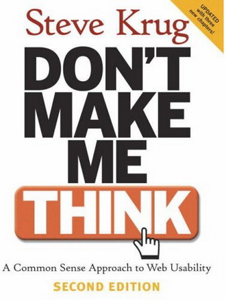
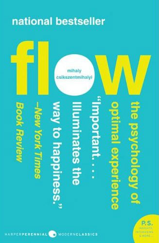
The first step in making your products easy to learn and use, is to know your users. There is an oft quoted saying in the User Experience industry that tells it all – “Know thy user and you are not your user”. The next step is to design and develop the product in such a way that it is intuitive and clear for users. Cluttered and dense interfaces, confusing controls, unclear messages, lack of help when needed- all of these make it hard for your new users. As Steve Krug puts it in his book, ‘Don’t make me think’, the moment you let your users start thinking about how to use any feature or functionality, you start to lose the user ‘s interest. Also, there should be a flow that lets users feel immersed when doing a task. This would make them not only feel that they accomplished the task but also delighted. I would equate this to the concept of flow as explained by Mihaly Csikszentmihalyi in his classic book on psychology – “Flow: the psychology of optimal experience”.
Who are you creating the product for
To be able to design your product better for ease of learning and use, you need to clearly identify who you are creating the product for. Going back to the ATM card example which we discussed above, the product was intended to be used by the larger number of users with little or no literacy, who would have never seen, leave alone using a computer before in their life. It was designed and developed knowing fully well that it needs to work with all the users with different backgrounds and literacy levels.
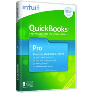
The beauty of the ATM product lies in that they cleverly disguised a computer into the machine. Without users’ knowledge, they are actually using a computer and its all made so much of a breeze to use it. No wonder, the concept and product caught up and it has changed the very definition of ‘banking’ on a global scale. Another case in point is Intuit’s QuickBooks. While every other accounting product in the market was geared towards the accountants and qualified book keeping professionals, Intuit understood that there is a huge demand for a simplified accounting product for the non-accountants and novices. They launched QuickBooks with the sole focus on this segment of users and today it is the most successful product in that segment, popular for its ease of use among new and expert users, as well.
Expertise and experience make a big difference
I would suggest that you classify your existing and/or potential users, based on the following:
- Demographics
- Education and computer literacy
- Professional
- Psycho-graphic (attitudes, likes and behaviors)
- Tasks and scenarios
More importantly, to make your product easy to use, you must first profile your users based on the product usage experience. The following is a typical way of classifying the user groups, but you can adapt this and modify it to suit your needs.
- Novice /beginners
- Intermediate
- Advance
- Expert/experience
Specify your target
- Identify the composition and distribution of your existing and proposed user base
- Have a clear markup of the proportion of new users vis-a-vis advanced or expert users
- Specify which of the above user types you will target with the product
- This is applicable equally to the features and functionality and not only to the entire product
Here is how you can make IT easy
Beside the above suggestions from my experience, I offer a few other tips below to do a quick check on how effective your product or feature in the scale of ease of learning and use. You might use these as guidelines during the design and development of the product or as checkpoints to validate the features and functionality in your product. I am classifying them into the typical buckets of user experience, so that its easy to assess them individually.
Functionality
- What can I do with this product?
- What do I need to do, so that I can achieve my goals?
Navigation
- Where am I now?
- Where can I go from here?
Interaction
- What should I do to make this work?
- How responsive is it to my inputs?
Presentation
- Does this look pleasing to my eyes?
- Am I distorting anything to make it appear what it is not?
Help
- Can I get help when I need?
- Is help provided when I require it?
As always, hope you find this post informative and useful. Please do give me your feedback. Until next post, ciao!
ZFTD32WWJGMW


Responses